A psychologist's website, in her own words.
Seven Wix pages became one fast page that works on a phone. Her number is on every screen, and her writing stayed hers.
The brief
Anne Vano is a licensed psychologist in Mill Valley with twenty-five years in practice. Her site was a seven-page Wix template: slow, awkward on a phone, and easy to lose the one thing a person in a hard moment needs, the phone number.
She also had no use for the usual therapist website: stock photo, stock headline, stock promise. Her writing is why her practice sounds like a person. Any redesign had to protect it.
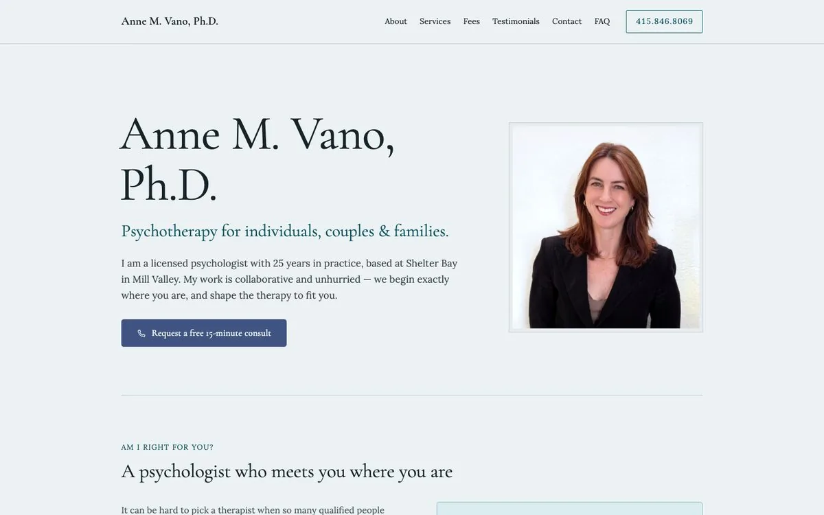
What we built
Seven pages became one
Five sections and one link to send. Everything the old nav held is a scroll away.
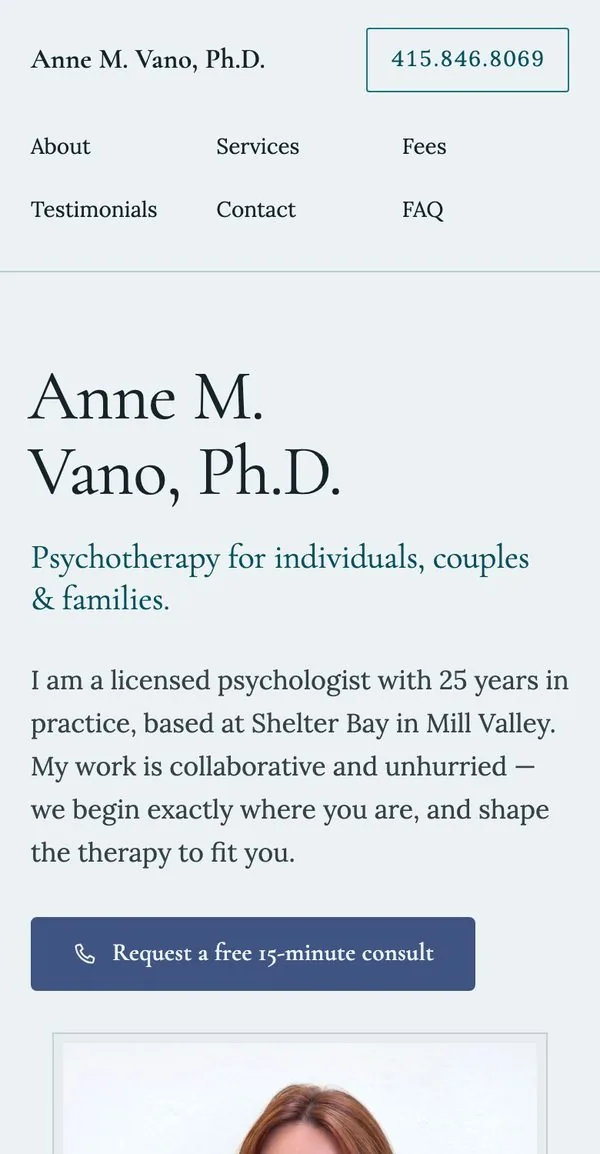
Her number is on every screen
It sits in the header and taps to call. The free 15-minute consult is the one button that matters, and it looks like it.
A form for people not ready to call
It opens a pre-filled email, so nothing is stored on anyone's behalf.
No third parties watching
No outside scripts, no font service, no Google Maps embed. The map is a still image that links out. For a site about therapy, a visitor's browser should talk to her site and nobody else.
Fast on purpose
Plain static pages with self-hosted fonts. Her portrait went from 2.3 MB to 75 KB, and on the day we measured, the page was interactive in under 200 milliseconds.
The details behind the scenes
Proper headings, real alt text, a canonical address, and preview cards for when someone shares the link.
Decisions worth explaining
Her words are fixed content
Early on, we tried a shorter version of her service descriptions to keep the page from running long on a phone. She preferred her original wording, and she was right. Those descriptions are where her voice is thickest, and her words are what make the site hers.
Length is a layout problem
We restored every sentence. From then on, long copy gets solved with type size, spacing and how sections open, never by cutting what she wrote. The same goes for the endorsements from her colleagues.
The result
A one-page site that loads fast, reads well on a phone, keeps her number a tap away and sounds like her, because it's her words.
Her site now carries a small credit line in the footer. Visit annevano.com
Run a practice?
Tell us what your current site gets wrong. We'll tell you what we'd change first.